The Most Important Chart In Crypto

Gm friends, and welcome back to another edition of Syko Therapy!
Todays edition is dedicated to what I believe is the most important chart in the entire Crypto space. Any guesses?
This one chart tell us more about the overall market position, and where we should be focusing our attention, than any other chart possibly could. Now, you would’ve seen me reference this chart a number of times throughout the analysis I create for you here. However, I recognise the fact that some of you might not truly understand why this chart is as important as it is, and also not fully grasp everything that goes into this one piece of data.
So today, I will be doing an in-depth overview into this chart, what it signifies, what it means at different phases, and why it is so important in understanding the overall Crypto market position.
Before we dive into that, I’m excited to share that I will be providing paid subscribers with another high-level, completely free indicator today. My goal here isn’t just to tell you things, it’s to help you become better traders/investors, and these custom indicators I have designed will do exactly that!
This indicator is a Syko Sell indicator, that with a 90%+ accuracy rating, helps you get ahead of decent market drops(you can see it yourself below). This accuracy rating is as good as it gets. If you’re not a paid subscriber yet, upgrading your subscription today provides you access to all these indicators(with more to come), included in the newsletter subscription.
Sneak Preview
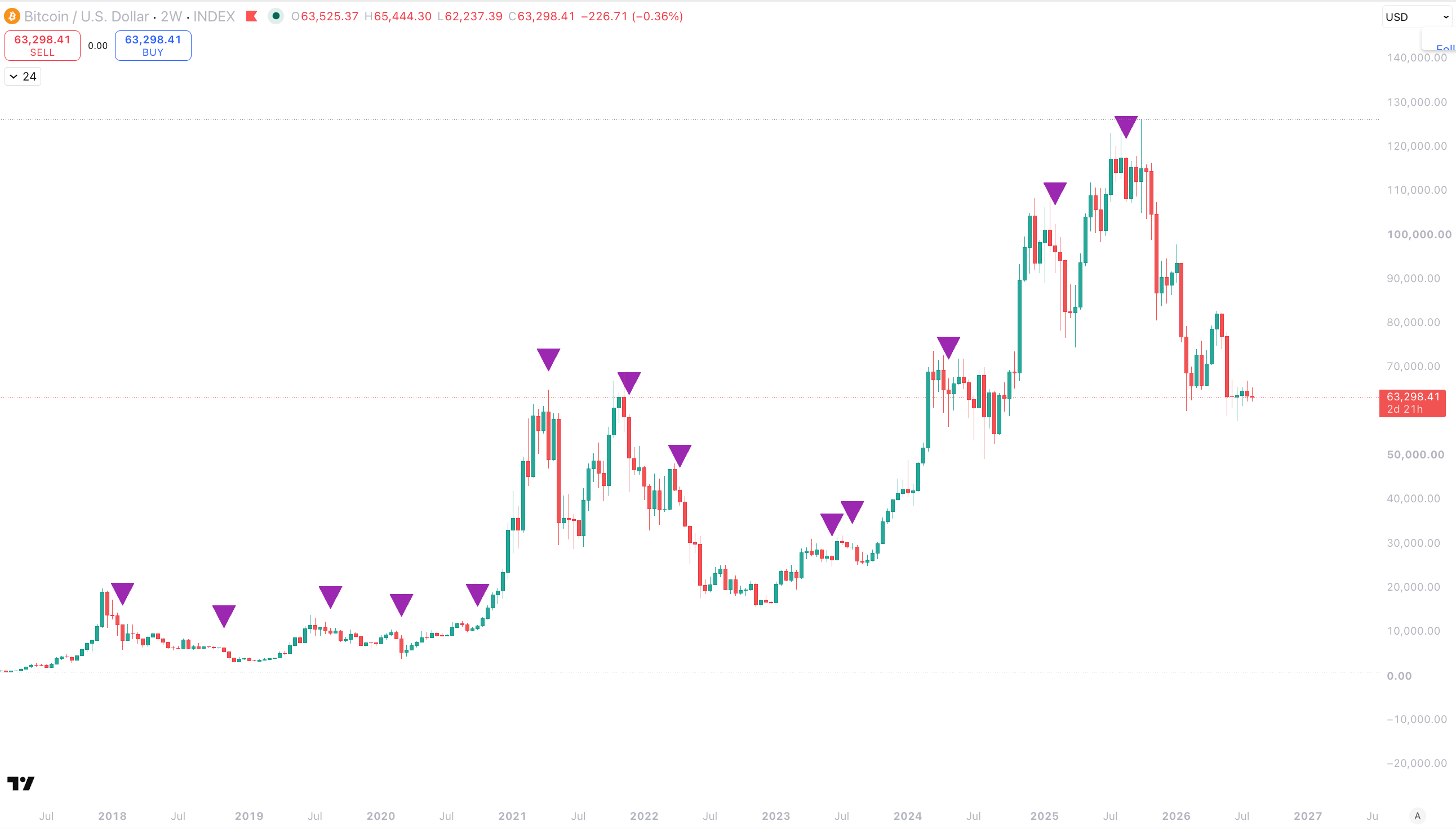
Anyway, the chart I am talking about is the ETH/BTC chart.
Let’s dive in!
What Is It?
First and foremost, you need to understand exactly what the ETH/BTC chart is.
ETH/BTC is an index that charts for us the relationship between Ethereum and Bitcoin. It signals to us the periods in which Ethereum is more dominant, and the then on the opposite side, the period in which Bitcoin is more dominant.
The relationship between these two is incredibly important for many reasons, but most simply, they are the two largest assets in the space and together, account for almost 70% of the total crypto market cap between them.
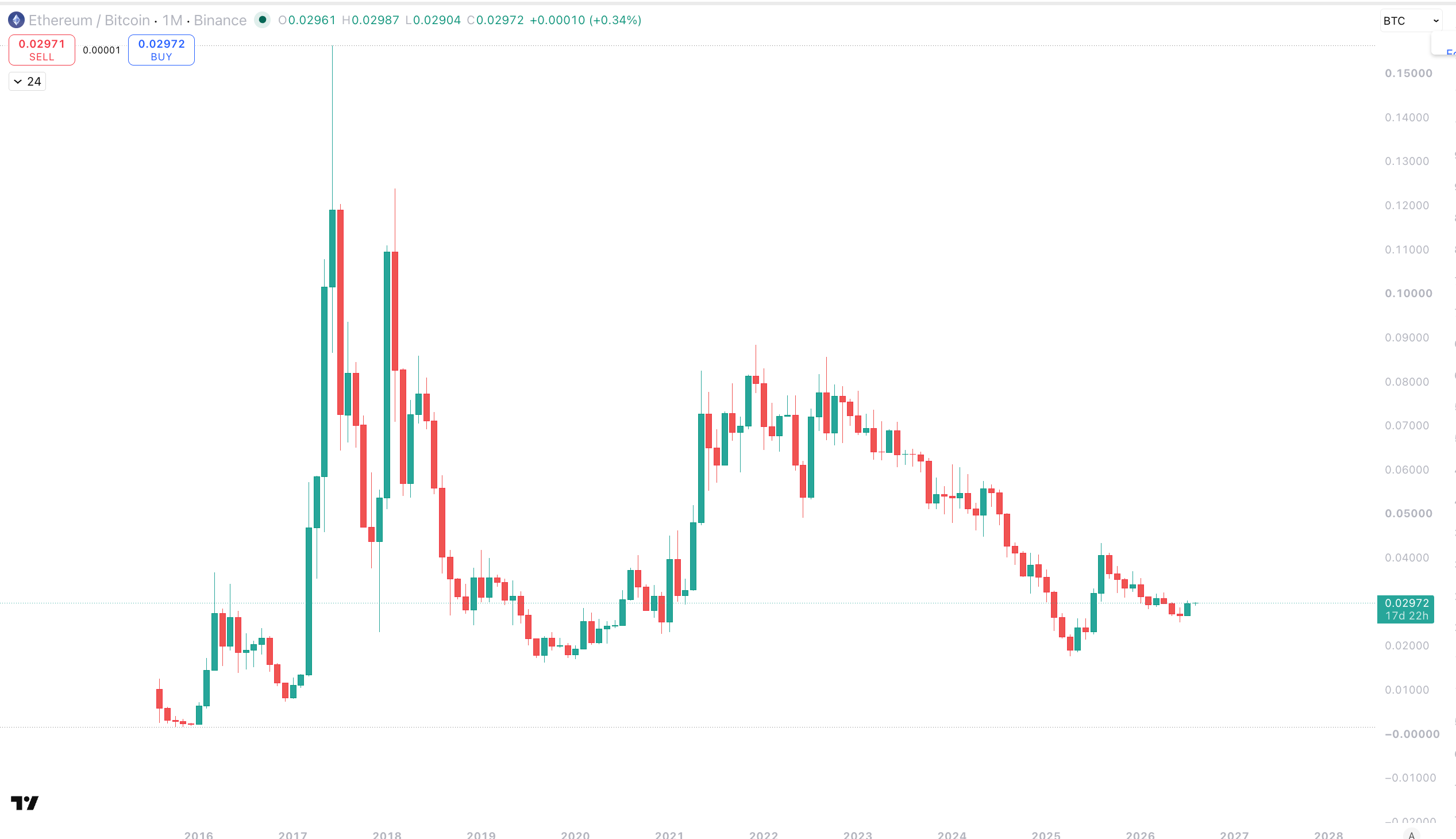
Above is the basic definition of what this chart is, but the overall picture goes much deeper than that.
ETH/BTC = LIQUIDITY
Everything in Crypto is about liquidity. ETH/BTC is our proxy for how that liquidity is behaving and will likely behave for a while into the future.
A very important thing to understand is that liquidity has a very strict process in which it manoeuvres its way through the market. It is not random, not by any means. And I am going to show and explain to you why ETH/BTC is so important to understand where liquidity currently is, and where it wants to go. By reading the ETH/BTC chart correctly, we can get a fantastic read on what is highly likely to unfold over the following 12 months and beyond.
Let us first cover off some core principles about how liquidity moves through the market.
Bitcoin is the king that sits atop the Crypto throne. Almost all liquidity flows through the King, and the King decides in which way the market moves. We have all seen it. You can have the most bullish altcoin in the world, but if Bitcoin decides it wants to go lower, your altcoin is getting dragged lower - absolutely nothing it can do. This is because Bitcoin controls the liquidity in the market and if Bitcoin is losing value, then the overall space is losing value. On the other side of this, however, if Bitcoin is gaining in value, then so too is the space.
“A rising tide carries all ships”.
Now, to understand how liquidity flows through the Crypto market, you can imagine it like a champagne glass tower.

The champagne is the liquidity, the glasses are the way in which it moves through the market.
First and foremost Bitcoin sits at the top and gets its fill, has its run, dominates the market, and everything else goes thirsty. We have seen this happen in live reality, over the last few years, as the first half of this major cycle has been totally dominated by Bitcoin. From there though, once Bitcoin has had its fill, the champagne then begins to pour into the lower glasses, starting firstly with ETH. Once ETH has had its fill, it then moves its way through the lower glasses(altcoins), and the cycle moves toward the end game.
At that point the champagne runs out - party’s over! It’s been drunk by all the sellers and smart money, and the dancing stops. Once the champagne has been drunk, the market has a large hangover(bear market), and no one wants any champagne for a while. Eventually, as time passes and the headaches wear off, the market gets a taste for champagne again, but not much, and the process starts over again with there only being enough Champagne for the Bitcoins glass.
We can see how this works in live time by checking out the ETH/BTC chart.
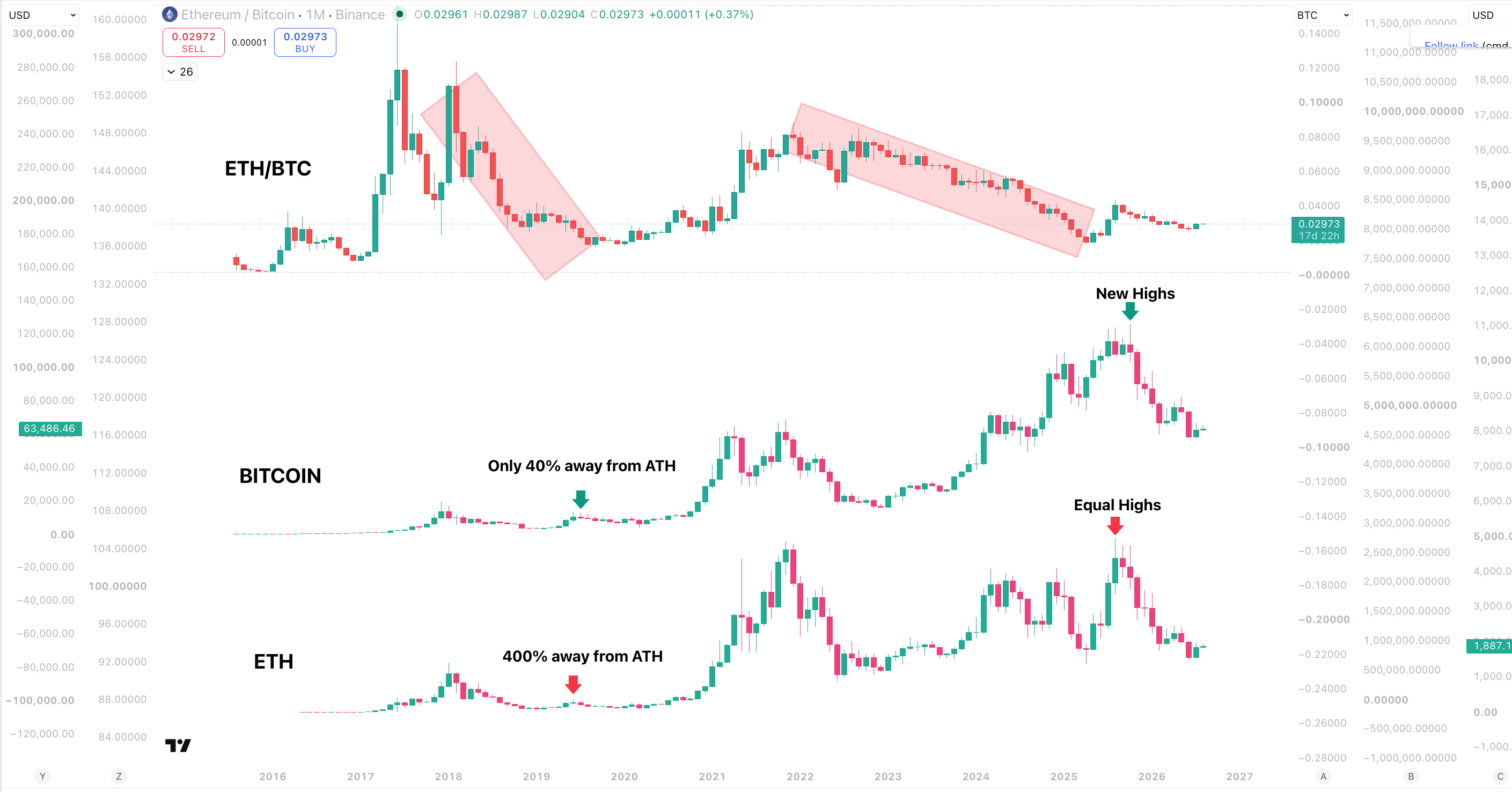
Let’s break this down.
At the true cycle top ETH/BTC begins a downtrend, meaning that ETH is losing strength against BTC. This means either more liquidity is flowing into BTC then ETH, or more is flowing out of ETH than BTC. Either way, the result is the same. BTC is more dominant. And in a weak market, during a full cycle bear and then first stage bull, BTC is always more dominant because it is the largest and safest asset.
Between 2018 and 2020 when this process is happening, both BTC and ETH are in a bear market, entering a new bull. As the new bull gets underway the overall space has a mid cycle run where BTC pushes all the way until it is only 40% from ATH. However, ETH barely pushes at all and tops out over 400% away from its ATH. Altcoins, nonexistent.
Sound familiar?
The same thing has happened within this cycle. BTC made new highs(ETFs, adoption, regulation), ETH did not. And we can see that this was always going to happen when we observe how the ETH/BTC chart was behaving. Both times, liquidity was heavily concentrated into BTC as it stole the show, and gave hardly any to the rest of the market.
Then things changed - ETH/BTC bottomed.
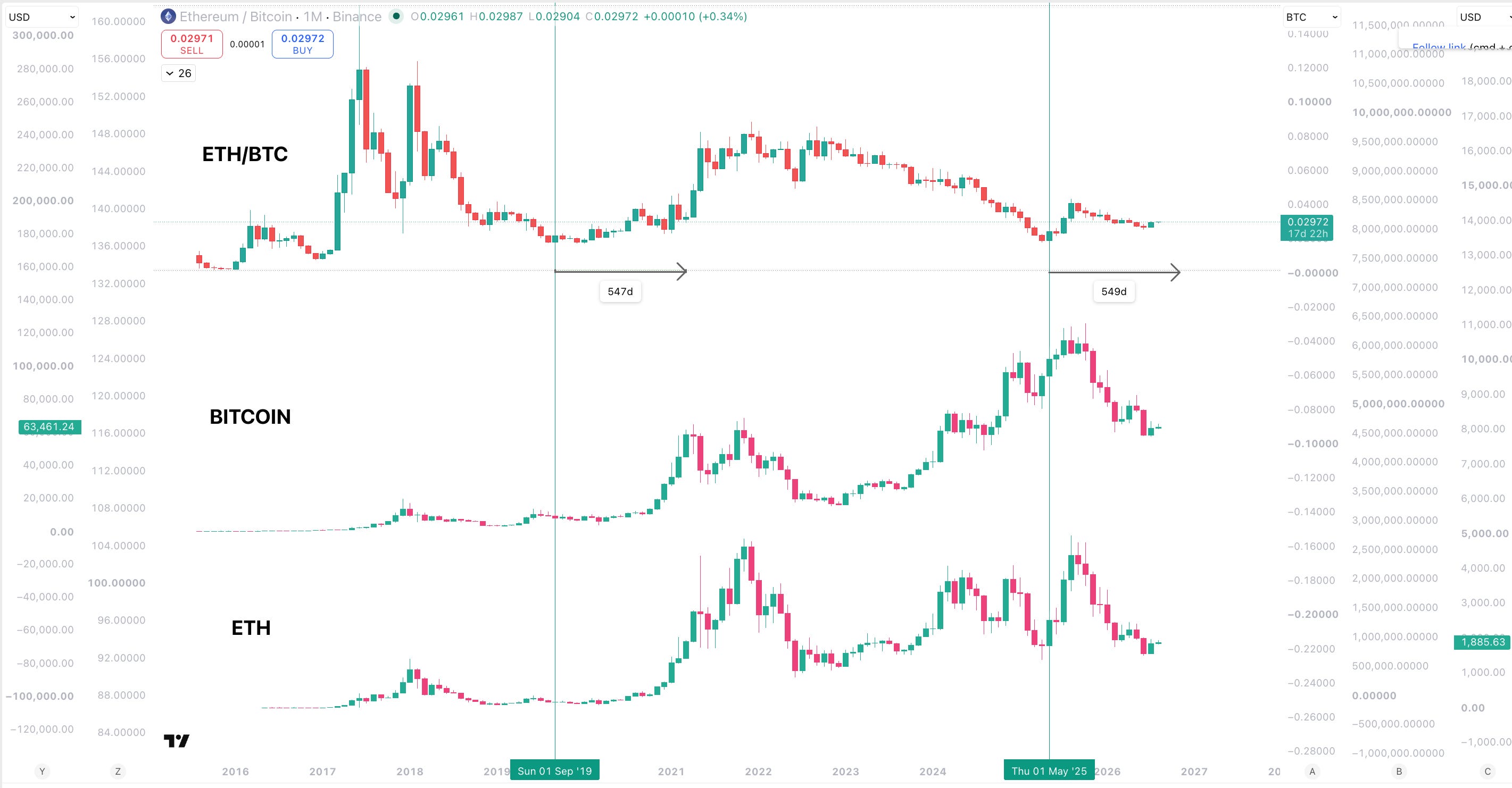
From that point onwards in 2019, ETH went on to 20x.
Bitcoin went on to 6x.
As ETH/BTC put in that bottom, it showed us that the overall market dynamic had shifted. That liquidity was not leaving ETH as aggressively as before, it was beginning to enter it. We could see, observing ETH/BTC, the period of outperformance that was going to come. And we are in a very similar position today.
ETH/BTC Tells Us Overall Cycle Position
Now that we understand how the liquidity cycle works within the Crypto market, we can understand the way in which ETH/BTC is the most important chart for showing us where that liquidity cycle currently is.
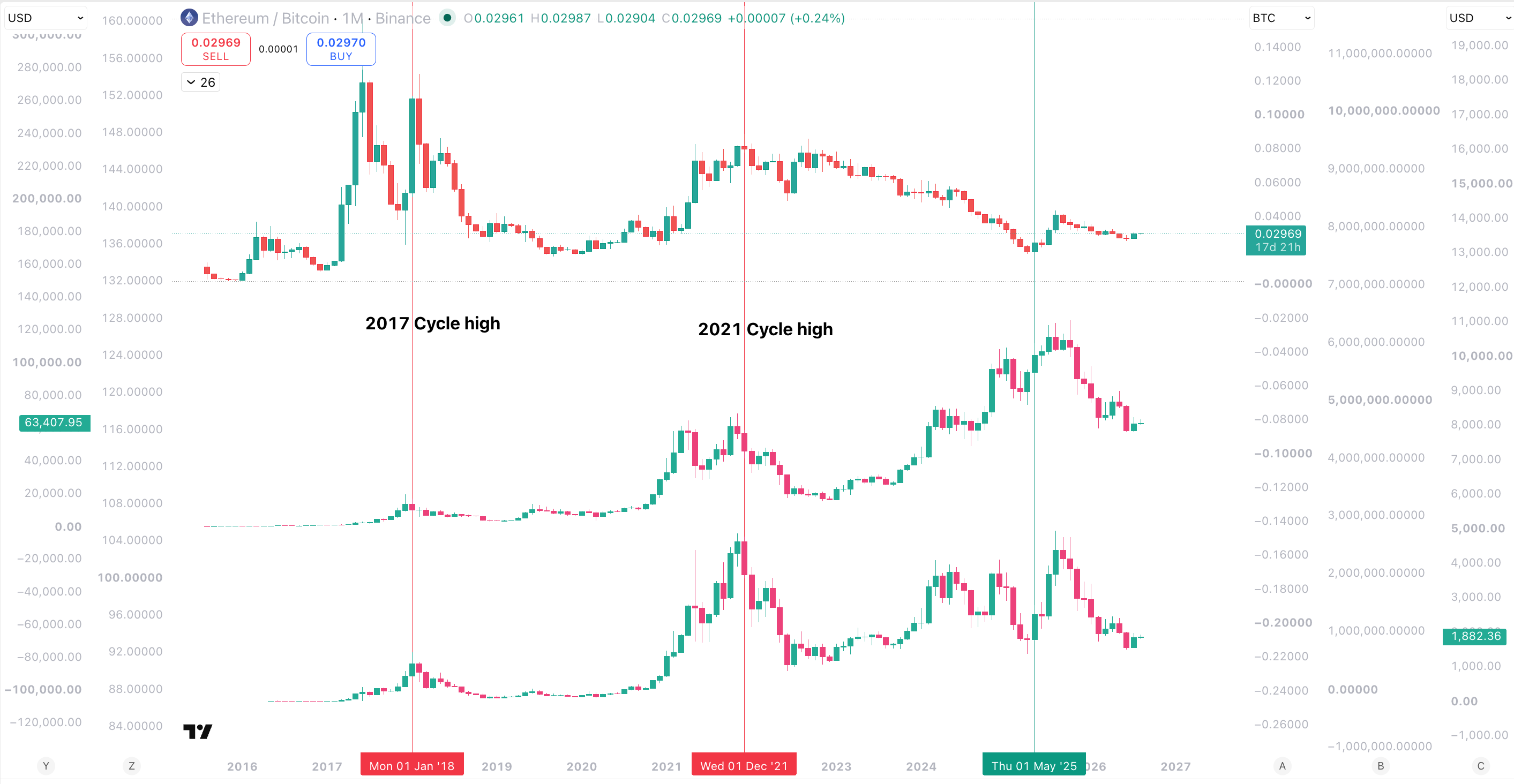
We can see that each previous market top was totally aligned with a large ETH/BTC run.
What is pictured there is BTC leading, with the liquidity flowing from BTC to ETH, ETH/BTC pushing hard, ETH pushing harder, and the liquidity cycle reaching its climax before everything tops out at around the same time. At that point, BTC begins its period of becoming more dominant again. This time, however, things could not look more different.
Within this current cycle the ETH/BTC bottom was actually very close to the Bitcoin top. However, if this was truly the overall cycle top, the liquidity cycle would be ending, and ETH/BTC would be entering a HTF downtrend, not a HTF uptrend.
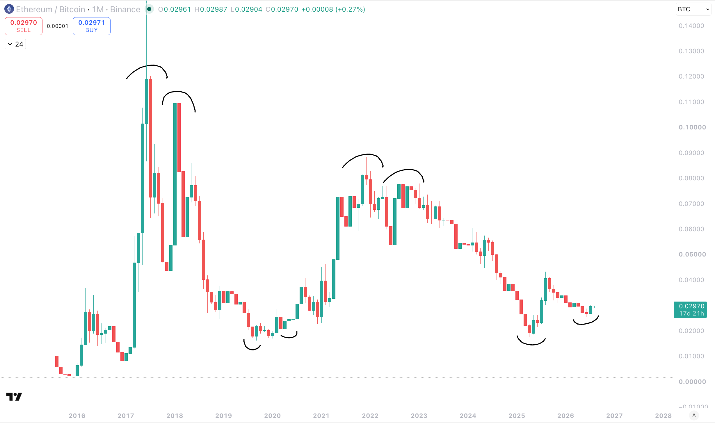
Through ETH/BTC, the liquidity cycle is telling us that it has only just begun the phase in which it starts to favour ETH and the lower parts of the market.
This is a period that takes time and does not happen overnight. But as we can see from the ETH/BTC chart, once this process begins to happen, it happens over the period of years, and does not simply enter a new trend for a matter of months and reverse again.
This is why the ETH/BTC chart is the strongest chart out there for the mid cycle phase/correction that I believe we are in. It is not just a chart on a screen, it is literally showing us the overall liquidity picture of the Crypto market and how that is effecting the strength of ETH against BTC. Champagne has started to leak over into ETH more than BTC, and it is a process that once it starts, will continue until it is done, and we reach the end of the party.
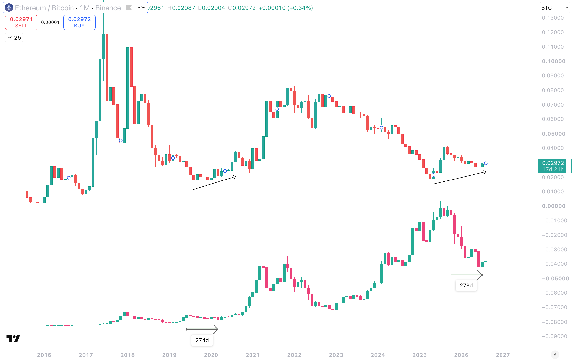
It doesn’t get much cleaner than this guys.
ETH/BTC bottoming and moving into an uptrend, as BTC corrects mid cycle.
What this tells us is that BTC is no longer dominant, and if we were at the end of the liquidity cycle, just like we have been at the previous highs in 2017 and 2021, BTC would be heavily dominant. That is just the way it works.
BUT WHY DOES IT WORK THAT WAY?
In addition to the ETH/BTC chart being about liquidity, it also tells us a story on overall investor sentiment.
After a true cycle ending bear market, everything has been absolutely destroyed from screaming ATHs across the board. As the market finds its bottom, sentiment is so bad that investors only really feel safe putting money into Bitcoin as it is:
Very low and heavily oversold after a likely 75% - 80% drop
The largest and “safest” asset in Crypto
So, therefore, naturally, it is the first asset to receive new liquidity, which ultimately begins the next cycle.
After time, Bitcoin goes on its run and rises higher, kinda dragging the rest of the market with it, but not really. As I showed you guys above, the wider market doesn’t really move in the first half of a cycle as ETH/BTC is in a downtrend.
From that mid cycle correction point as ETH/BTC bottoms, things change. Bitcoin starts to move again, but now the mid cycle point is over, the momentum is back into the market and investors begin to eye other opportunities after BTC has already had its first decent run. The market continues to move and ETH and other large alts begin to move well, and continue to keep moving well.
As the upper part of the market gathers momentum and Bitcoin starts its final run, more and more people feel bullish and comfortable seeking other opportunities. The liquidity continues to pick up pace in the lower parts of the market, until you eventually get the alt szn style of market run that marks the overall top.
What you have to understand is none of this is random guys - it is all a gradual process with one action naturally leading to the other, in an emotional decision making process by investors, based on what is happening within the liquidity cycle and how they respond to it.
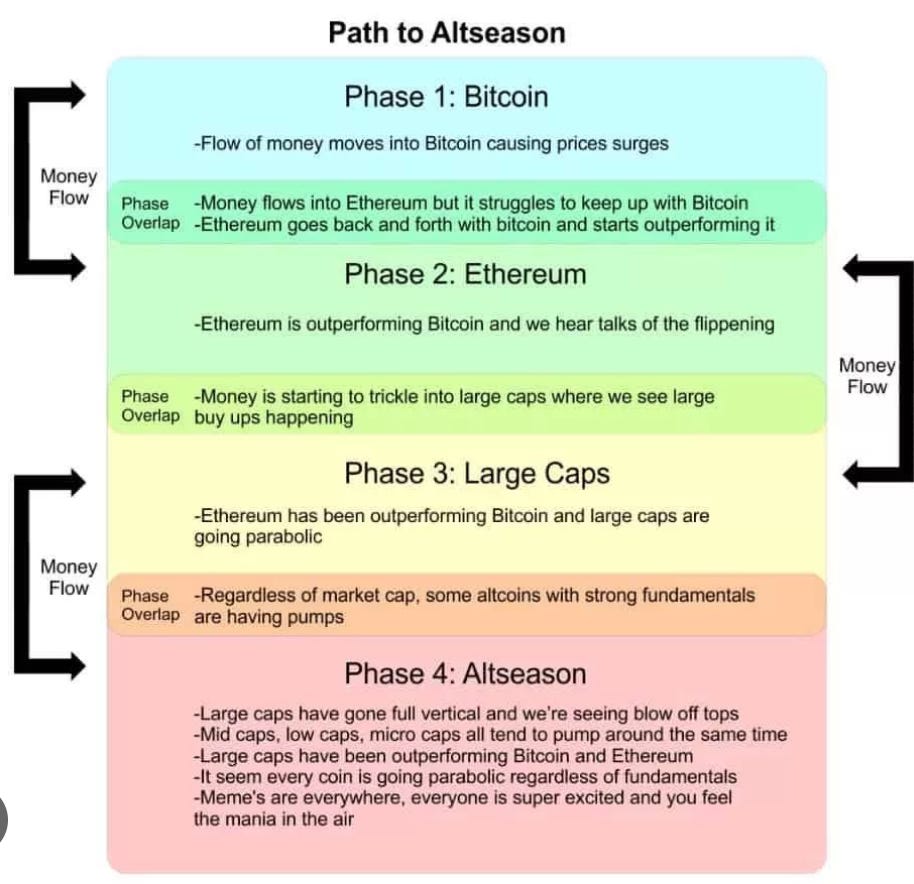
BTC moves first after the bear because no one believes in anything else
After BTC moves sentiment improves and people seek other opportunities
People seeking those opportunities creates rising prices, and therefore, more people seek them
Now BTC and the assets in the higher end of the market are all moving, things become even more bullish
Investors, now very bullish, seek even more opportunities lower down
The bottom half of the market starts to move hard and even more investors seek opportunities
All the way until micro caps are flying and the market is euphoric
Aaaaaaand things a bit silly just before its all over
This gradual process has marked every single market cycle ever, not just in Crypto. It is a gradual phase from max bearishness to max bullishness, ignited by the liquidity cycle. And, using the ETH/BTC chart, we can accurately understand where we are in that within that the liquidity cycle, and therefore, the overall market cycle.
What ETH/BTC is showing us at this very moment is that it is not at its cycle high. It is only just past its cycle low. That ETH is stronger than BTC, after 5 years of BTC being dominant. If we had already followed the full liquidity cycle, ETH/BTC would be in a strong downtrend along with BTC, but it is not.
Overall, for every reason I have provided above, ETH/BTC is our main indicator for which phase the overall cycle is in.
I hope that makes sense :)